We know colours are the first thing to attract most of us to picking up a product. Research shows that 62%-90% of people’s first impressions of a product are based off the product’s colours alone.
Moreover, colour helps develop a stronger sense of brand recognition.

McDonalds
airbnb
Amazon
Burger King
Slack
Sprite
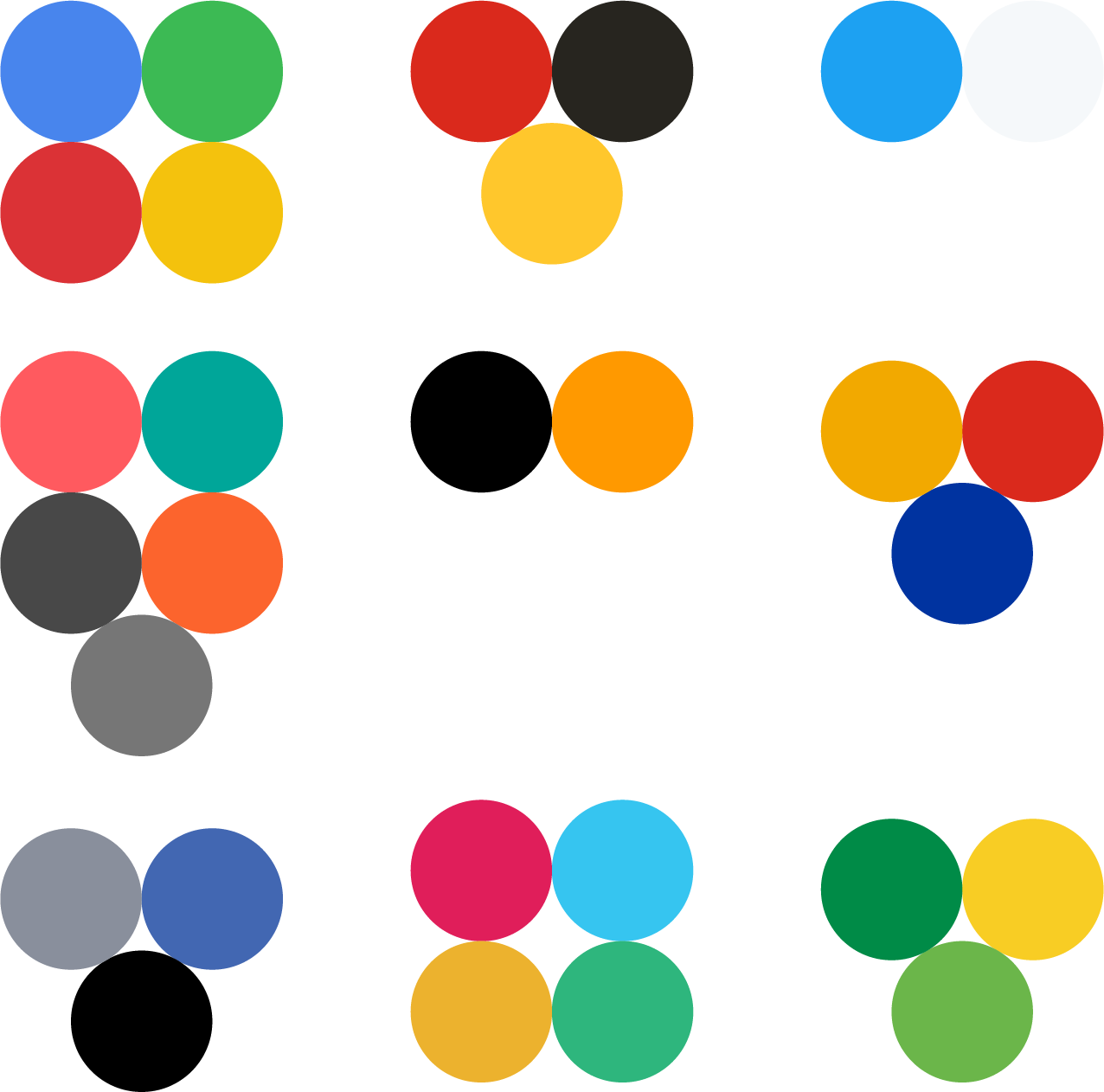
Colour palettes give a brand its personality, and give us something to connect with. Google uses primary colours, which suggests quite a simple and friendly approach to its services. The colour palette feels reliable in ways, maybe it’s how vibrant yet soft they are. The sense of reliability the brand gives off is probably why so many people use multiple Google services everyday. Amazon is another example, we know when we receive an Amazon parcel, or use an Amazon service, because it’s brand is cohesive.


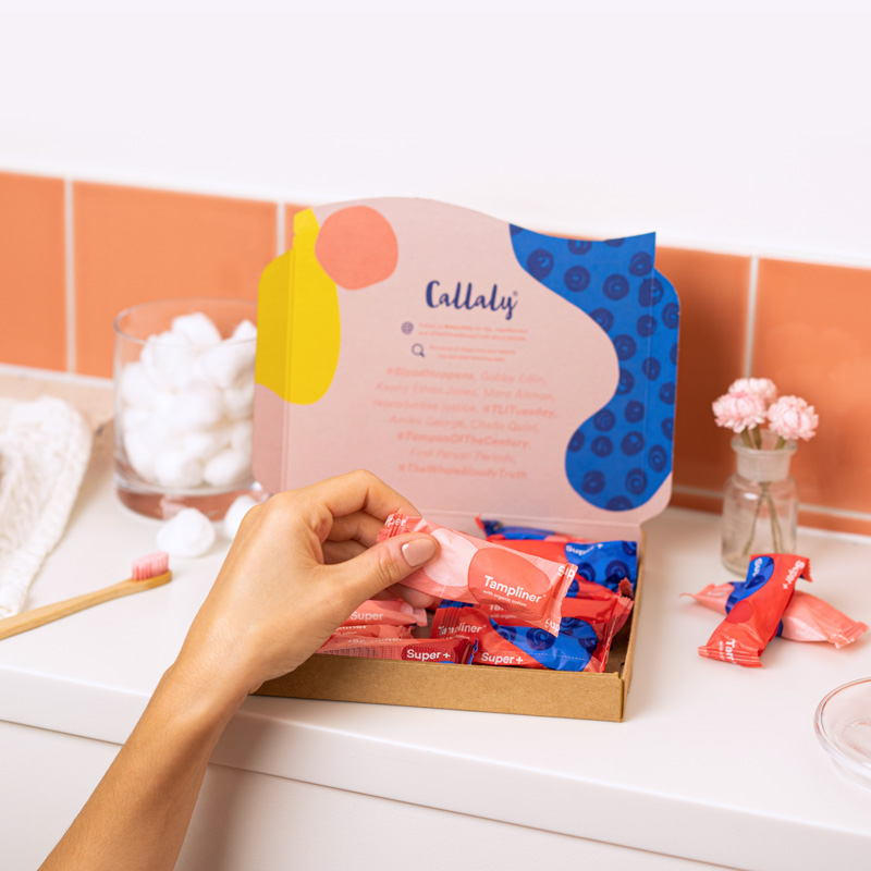
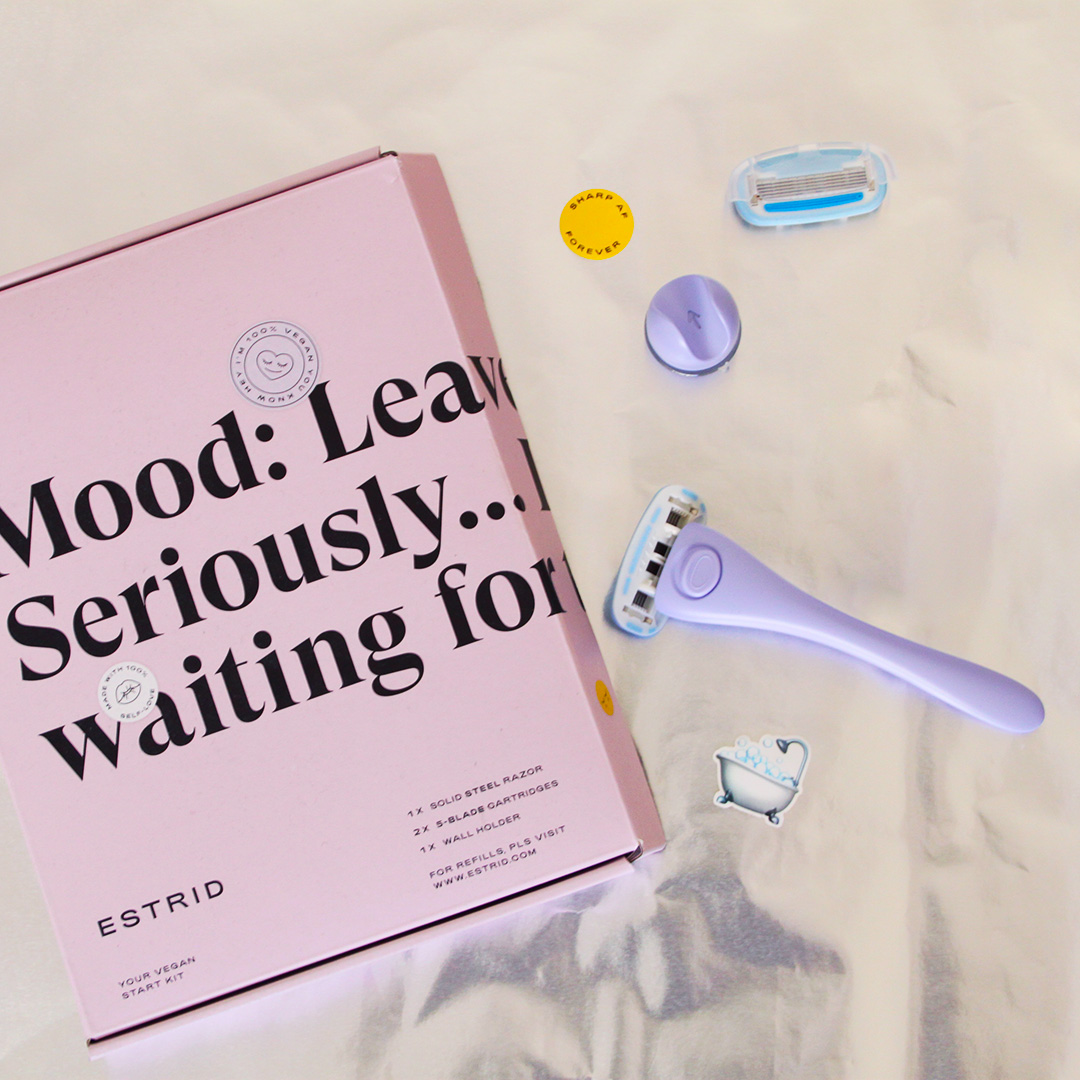
Companies like Callaly and Estrid have done really well with product brand recognition.
Both companies have a strong brand presence in their packaging alone, it’s an experience. Notice how both brands use really soft and gentle colour palettes; they both use the colour pink, which in a lot of research is reflective of tenderness, beauty, emotion, all of which create a reassuring and positive tone of voice from the brand.
Receiving subscription boxes automatically makes you feel connected to a brand anyway, but self-care subscription boxes, with a gentle yet positive tone of voice throughout their brand feels extremely special.
Both of these brands foster a sense of community through their subscriptions, and their packaging holds so much personality that they make it easy for their customers to connect with them.